

Think about the last time you searched for a local business. Chances are you were on your phone – on the U-Bahn, in a café, or standing outside a shop. Your customers are no different. For most local businesses, the majority of website visits now come from mobile devices.
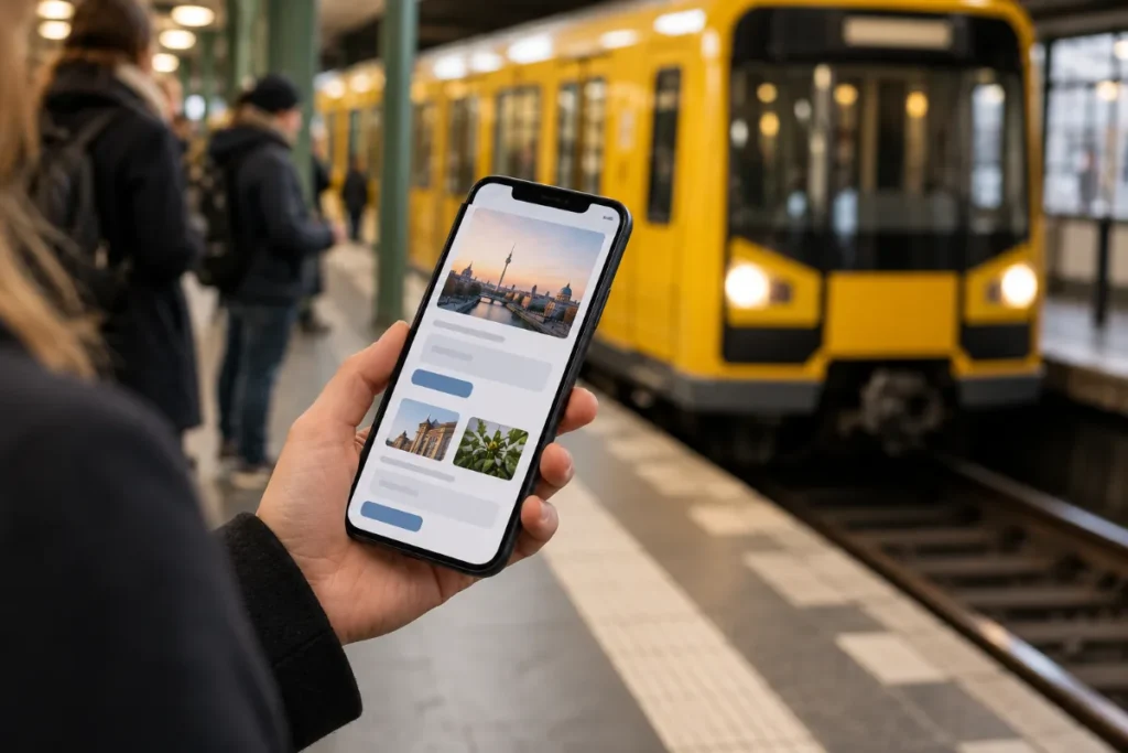
A mobile-first website is built for phones before anything else.
What "mobile first" really means
It's not just about a site that shrinks to fit a small screen. A mobile-first website is designed for the phone first: big readable text, buttons you can tap with a thumb, short sections and the most important information at the top.
Google looks at your mobile site
Google mainly uses the mobile version of your website to decide how to rank it. If your mobile site is slow, missing content or hard to use, your rankings can suffer – even if the desktop version looks great.
A 2-minute test you can do now
- Open your website on your phone using mobile data, not Wi-Fi.
- Can you see what you offer without scrolling?
- Can a visitor call you with one tap?
- Is the text readable without zooming?
- Do pop-ups or cookie banners cover everything?
- Can you fill in the contact form easily with your thumb?
If you struggled with any of these, so do your customers.
Quick improvements
- Put a clickable phone or WhatsApp button at the top.
- Compress large images – they're the most common cause of slow pages.
- Shorten long paragraphs and use clear headings.
- Remove sliders and animations that don't add value.
- Keep forms short: name, email, phone, message.
Mobile and local search go together
Many "near me" searches happen on phones, often minutes before someone visits or calls. A fast mobile site supports your district-level local SEO and turns those searches into customers.
Mobile-friendliness is one of the first points on our website checklist, and it matters just as much for the visitors who reach you through your Google Business Profile. Google explains the background in its documentation on mobile-first indexing.
Every site we build through our Berlin web design service is designed for phones first. Want us to check yours? Send us the link.
Is yours a mobile-first website?
Open your site on your phone. Can you read it without zooming? Can you tap the phone number? Does it load in a few seconds? If not, it is time to fix it. A mobile-first website keeps visitors and turns them into calls. Need help? See our web design service.
Need a hand? FrankBerlin builds smart websites in Berlin – fast, multilingual and Google-ready.
